외로운 Nova의 작업실
Flutter 프로그래밍 - 2(기본 위젯) 본문
안녕하세요, 이번 장에서는 flutter에서 사용하는 기본 위젯들을 알아보겠습니다.
- 텍스트 위젯
텍스트 위젯은 Text() 위젯을 사용합니다. main.dart 코드는 아래와 같습니다.
import 'package:flutter/material.dart';

void main() {
  runApp(MyApp());
}

class MyApp extends StatelessWidget {
  @override
  Widget build(BuildContext context){
    return MaterialApp(
      home: Scaffold(
        body: Center(
          child: Text(
            'Hello Nova',
            style: TextStyle(
              fontSize: 16.0,
              fontWeight: FontWeight.w700,
              color: Colors.blue,
            )
          )
        ),
      )
    );
  }
}
한번 실행 시켜보겠습니다.

- 제스처 관련 위젯
제스처란 사용자가 키보드로 글자를 입력하는 행위 외의 모든 입력을 플러터에서는 제스처라고 부릅니다. 예를들어 화면을 한번 탭한다던가, 두번 탭한다던가, 길게 누르는 행동 모두가 제스처입니다. 자주 사용하는 Elevated Button, Icon Button, GuestureDetector, FloatingActionButton 위젯을 한번 보겠습니다.
<Elevated Butten>
아래는 코드입니다.
import 'package:flutter/material.dart';

void main() {
  runApp(MyApp());
}

class MyApp extends StatelessWidget {
  @override
  Widget build(BuildContext context){
    return MaterialApp(
      home: Scaffold(
        body: Center(
          child: ElevatedButton(
            //클릭시 실행할 함수
            onPressed: () {},
            //버튼 스타일
            style: ElevatedButton.styleFrom(
              backgroundColor: Colors.red,
            ),
            //버튼에 들어갈 위젯
            child: Text('Elevated Button'),
          )
        ),
      )
    );
  }
}
실행시켜서 어떻게 생겼는지 보겠습니다.
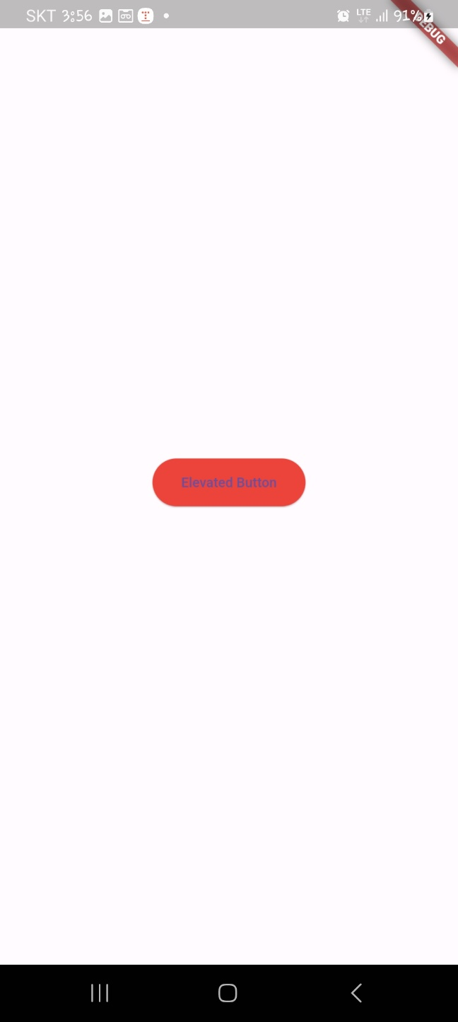
이렇게 예쁘게 생겼습니다.
<Icon Button>
IconButton은 아이콘을 버튼으로 생성하는 위젯입니다.Icon 매개변수에 보여주고싶은 아이콘을 넣을 수 있습니다. OnPressed 매개변수에 IconButton을 누르면 실행할 콜백 함수를 제공할 수 있습니다. 아이콘은 글리프 기반의 아이콘을 사용할 수 있습니다. 코드를 봐보도록 하겠습니다.
import 'package:flutter/material.dart';

void main() {
  runApp(MyApp());
}

class MyApp extends StatelessWidget {
  @override
  Widget build(BuildContext context){
    return MaterialApp(
      home: Scaffold(
        body: Center(
          child: IconButton(
            onPressed: () {},
            icon: Icon(
              Icons.home,
            )
          )
        ),
      )
    );
  }
}
기본적으로 플러터에서 제공해주는 아이콘을 적용시켜봤습니다. 어떻게 생겼는지 보겠습니다.
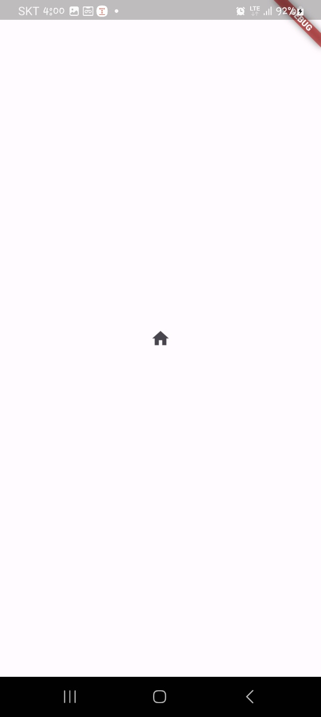
집 모양의 버튼이 나온 것을 확인할 수 있습니다.
<GestureDetector 위젯>
GestureDetector은 손가락으로 하는 여러가지 입력을 인지하는 위젯입니다. 위젯을 하나 만들어놓고 그 위젯을 한번, 두번 연속으로 누르거나 길게 누르거나 여러가지 제스처를 했을때 실행시키는 함수를 다르게 할 수 있습니다. 코드로 보겠습니다.
import 'package:flutter/material.dart';
void main() {
runApp(MyApp());
}
class MyApp extends StatelessWidget {
@override
Widget build(BuildContext context){
return MaterialApp(
home: Scaffold(
body: Center(
child: GestureDetector(
//한번 탭했을때 실행되는 함수
onTap: (){
print('on tap');
},
//두번 탭햇을때 실행되는 함수
onDoubleTap: (){
print('on doubl tap');
},
//길게 눌럿을때 실행하는 함수
onLongPress: (){
print('on long press');
},
//제스처를 적용할 위젯
child: Container(
decoration: BoxDecoration(
color: Colors.red,
),
width: 100.0,
height: 100.0,
),
)
),
)
);
}
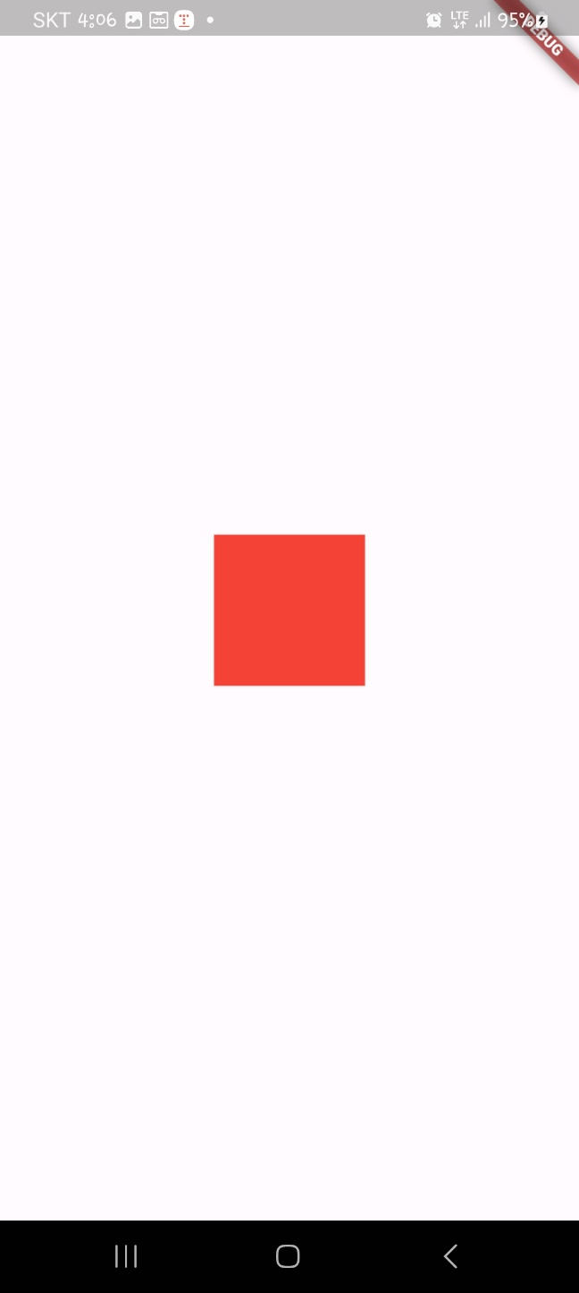
}너비와 높이가 100인 사각형을 만들고 그 사각형에 제스처를 하면 실행할 함수를 써놓았습니다. 한번 실행시켜보겠습니다.
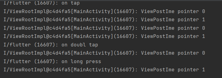
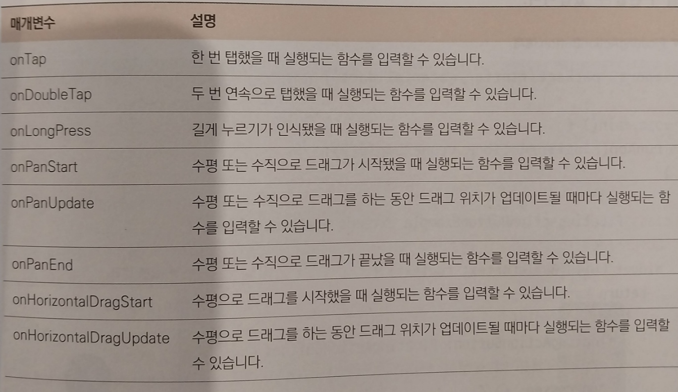
제스처를 하면 print가 실행되는 것을 확인할 수 있습니다. 아래는 제스처관련 매개변수입니다.
<FloatingActionButton>
FloatingActionButton은 Material Design에서 추구하는 버튼 형태입니다. 화면의 오른쪽 아래에 동그란 플로팅 작업 버튼을 쉽게 볼 수 있습니다. 이를 Scaffold와 같이 사용하면 특별한 어려움없이 해당 형태의 디자인을 구현할 수 있습니다.
import 'package:flutter/material.dart';

void main() {
  runApp(MyApp());
}

class MyApp extends StatelessWidget {
  @override
  Widget build(BuildContext context){
    return MaterialApp(
      home: Scaffold(
        floatingActionButton: FloatingActionButton(
          //클릭했을때 실행 함수
          onPressed: (){},
          child: Text('클릭'),
        ),
      body: Container(),
      ),
    );
  }
}
한번 실행해보겠습니다.
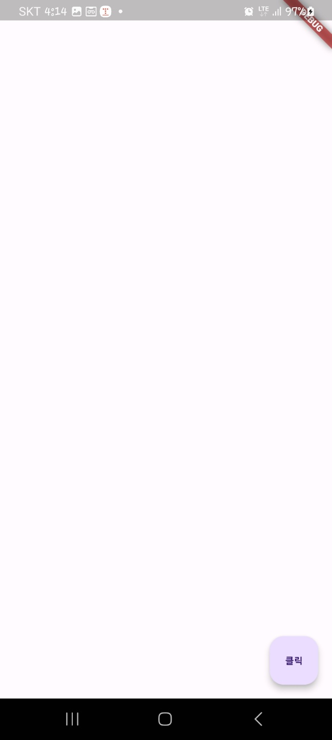
오른쪽 아래에 클릭버튼을 볼 수 있습니다.
- 디자인 관련 위젯
디자인 관련 위젯은 배경을 추가하거나 간격을 추가하거나 패딩을 추가하는 등 디자인적 요소를 적용할때 사용합니다.
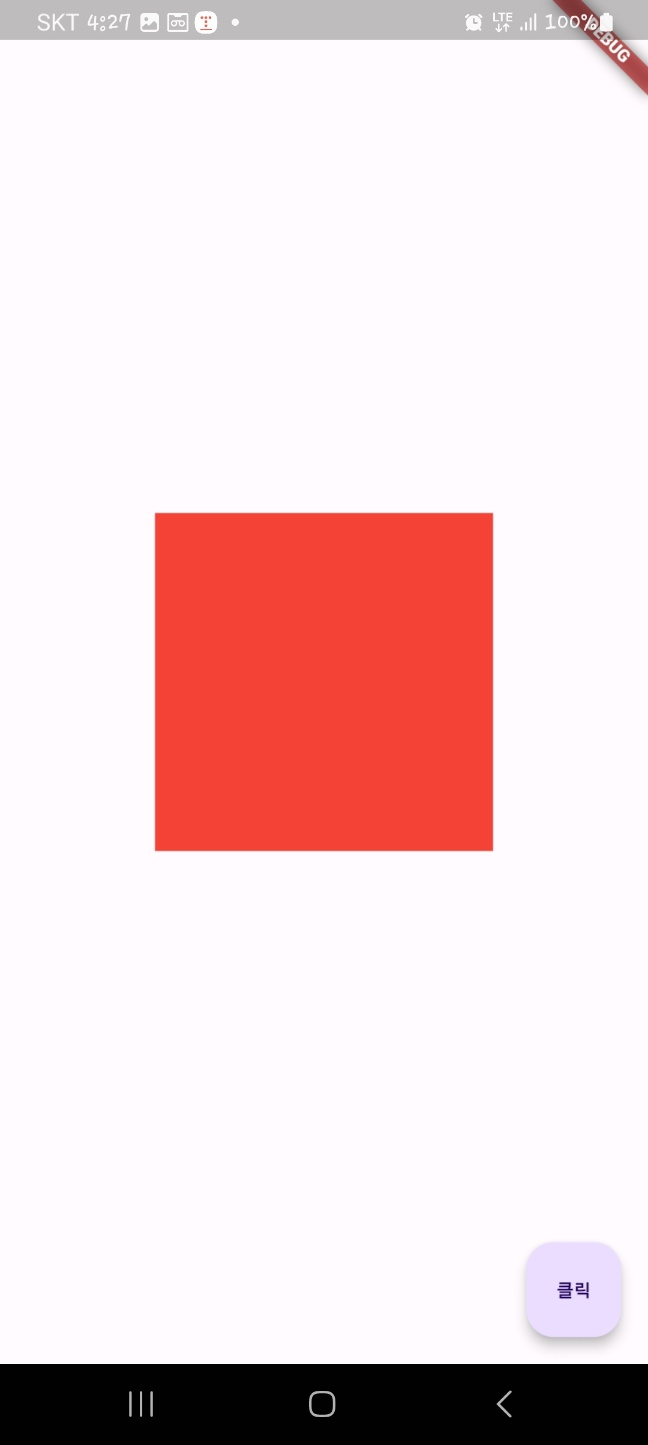
<Container 위젯>
Contatiner 위젯은 말그대로 다른 위젯을 담는 데 사용합니다. 위젯의 너비와 높이를 지정하거나 배경이나 테두리를 추가할 때 많이 사용됩니다.
import 'package:flutter/material.dart';

void main() {
  runApp(MyApp());
}

class MyApp extends StatelessWidget {
  @override
  Widget build(BuildContext context){
    return MaterialApp(
      home: Scaffold(
        floatingActionButton: FloatingActionButton(
          //클릭했을때 실행 함수
          onPressed: (){},
          child: Text('클릭'),
        ),
      body: Center(
        child: Container(
          //스타일 적용
          decoration: BoxDecoration(
            //배경 색
              color: Colors.red,
              //테두리
              border: Border.all(
                //테두리굵기
                width: 16.0,
                //테두리 색
                color: Colors.blue,
              ),
              //모서리 둥글게 만들기
              borderRadius: BorderRadius.circular(16.0)),
          height: 200.0,
          width: 200.0,
        ),
      )
      ),
    );
  }
}
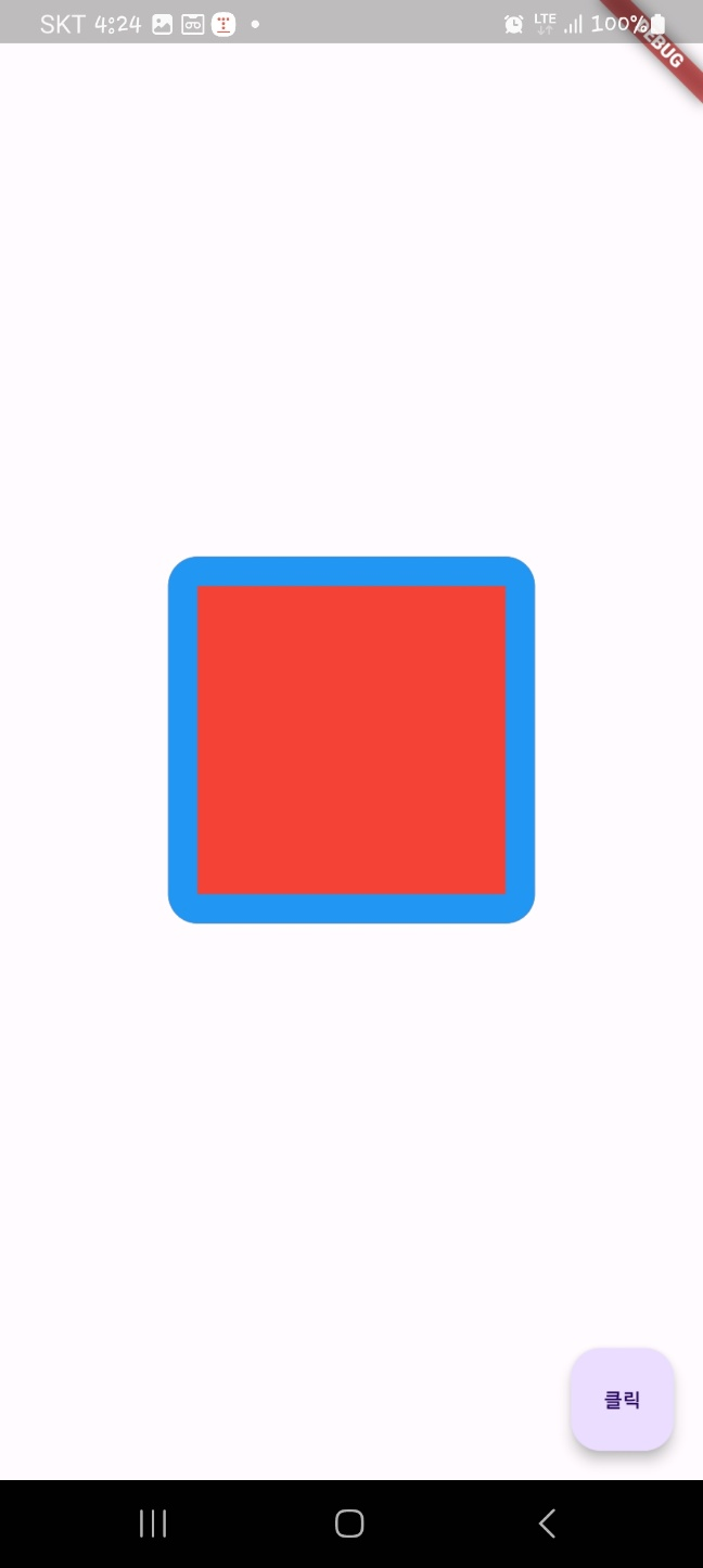
한번 실행시켜보겠습니다.
<SizedBox 위젯>
SizedBox 위젯은 일반적으로 일정 크기의 공간을 공백으로 두고 싶을때 사용됩니다. Container 위젯을 사용해도 공백을 만들 수 있지만 SizedBox는 const 생성자를 사용했을때 퍼포먼스에서 이점을 얻을 수 있습니다.
import 'package:flutter/material.dart';

void main() {
  runApp(MyApp());
}

class MyApp extends StatelessWidget {
  @override
  Widget build(BuildContext context){
    return MaterialApp(
      home: Scaffold(
        floatingActionButton: FloatingActionButton(
          //클릭했을때 실행 함수
          onPressed: (){},
          child: Text('클릭'),
        ),
      body: Center(
        child: SizedBox(
          height: 200.0,
          width: 200.0,

          //sizedbox는 색상이 없으므로 크기를 확인하는 container 추가
          child: Container(
            color: Colors.red,
          ),
        )
      )
      ),
    );
  }
}
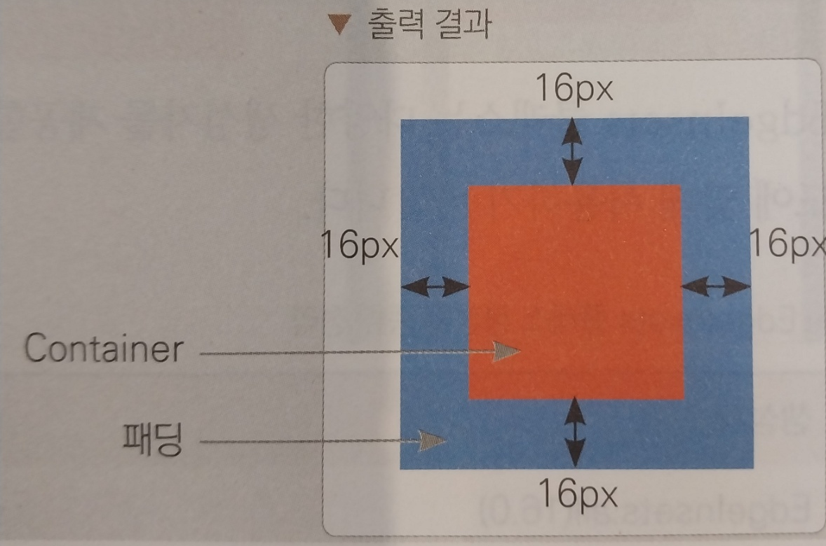
<Padding 위젯>
Padding 위젯은 child 위젯에 여백을 제공할 때 사용합니다. Padding 위젯을 사용하면 Padding 위젯의 상위 위젯과 하위 위젯 사이의 여백을 둘 수 있습니다. Padding 위젯의 padding 매개변수는 EdgeInsets라는 값을 입력해야합니다. 또한 child 매개변수에 padding을 적용하고싶은 위젯을 입력할 수 있습니다.
import 'package:flutter/material.dart';

void main() {
  runApp(MyApp());
}

class MyApp extends StatelessWidget {
  @override
  Widget build(BuildContext context){
    return MaterialApp(
      home: Scaffold(
        floatingActionButton: FloatingActionButton(
          //클릭했을때 실행 함수
          onPressed: (){},
          child: Text('클릭'),
        ),
      body: Center(
        child: Container(
          color: Colors.blue,
          child: Padding(

            //상하 좌우 모두 16픽셀씩 패딩
            padding: EdgeInsets.all(
              16.0,
            ),
                child: Container(
              color: Colors.red,
                  width: 50.0,
                  height: 50.0,
          ),
          ),
        )
      )
      ),
    );
  }
}
이렇게 코드를 짜면 안에 빨간색 컨테이너 50X50에서 상하좌우 16px씩 패딩이 적용되어 블루 컨테이너가 나옵니다.
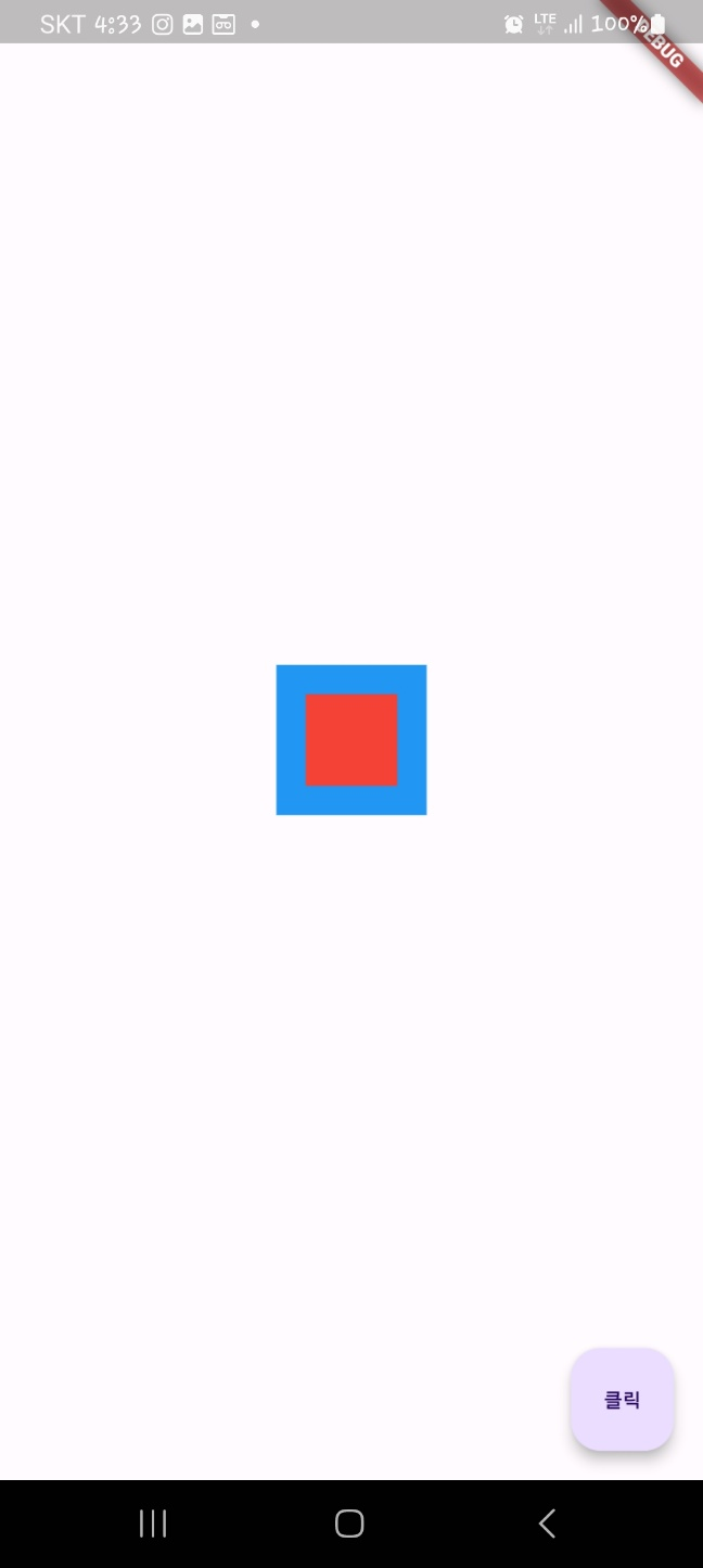
패딩말고 마진이라는 기능도 있습니다. 마진은 위젯이 따로 존재하지않고 Contatiner 위젯에 추가할 수 있습니다.
import 'package:flutter/material.dart';

void main() {
  runApp(MyApp());
}

class MyApp extends StatelessWidget {
  @override
  Widget build(BuildContext context){
    return MaterialApp(
      home: Scaffold(
        floatingActionButton: FloatingActionButton(
          //클릭했을때 실행 함수
          onPressed: (){},
          child: Text('클릭'),
        ),
      body: Center(
        //최상위 검정 컨테이너(margin 적용 대상)
        child: Container(
          color: Colors.black,

          //중간 파란 컨테이너
          child: Container(
            color: Colors.blue,

            //마진 적용 위치
            margin: EdgeInsets.all(16.0),

            //패딩 적용
            child: Padding(
              padding: EdgeInsets.all(16.0),

              //패딩이 적용된 빨간 컨테이너
              child: Container(
                color: Colors.red,
                width: 50.0,
                height: 50.0,
              ),
            ),
          ),
        )
      )
      ),
    );
  }
}
파란색이 마진때문에 검정보다 작고, 패딩이 있기에 빨간색이 파란색보다 작습니다.
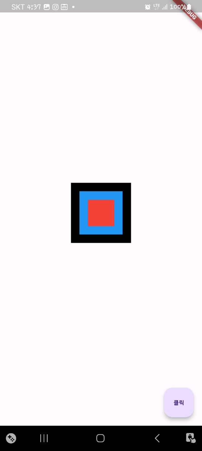
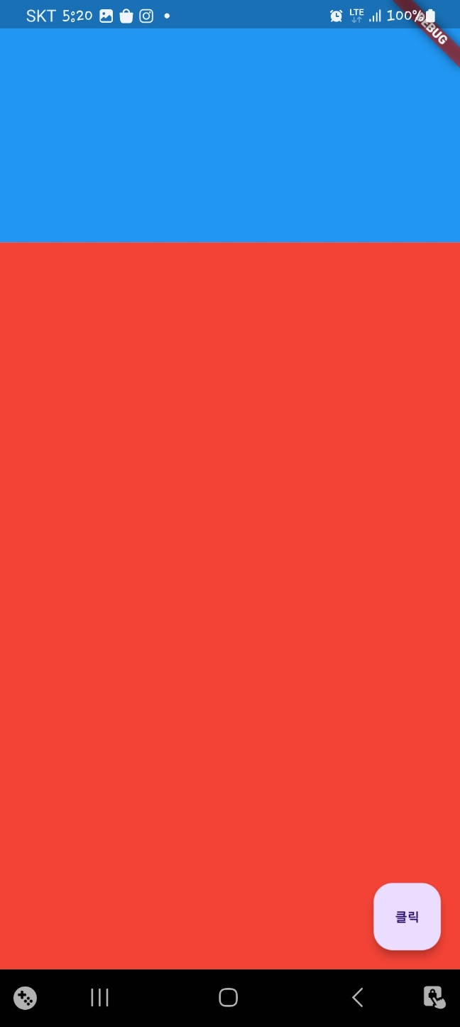
<SafeArea>
현대 핸드폰은 크기도 여러가지고 디자인도 여러가지인비낟. 툭히 애플 아이폰의 노치 디자인은 정말 특이한 디자인입니다. 플러터는 가용되는 화면을 모두 사용하기 때문에 노치가 있는 핸드폰에서 노치에 위젯들이 가릴 수 있습니다. SafeArea를 사용하면 따로 기기별로 예외처리하지않고 안전한 화면에서만 위젯을 그릴 수 있습니다.
import 'package:flutter/material.dart';

void main() {
  runApp(MyApp());
}

class MyApp extends StatelessWidget {
  @override
  Widget build(BuildContext context) {
    return MaterialApp(
      home: Scaffold(
        floatingActionButton: FloatingActionButton(
          onPressed: () {},
          child: Text('클릭'),
        ),
        body: SafeArea(
          //원하는 부위만 따로 적용가능
          top: true,
          bottom: true,
          left: true,
          right: true,
          child: Container(
            color: Colors.red,
            height: 300.0,
            width: 300.0,
          ),
        ),
      ),
    );
  }
}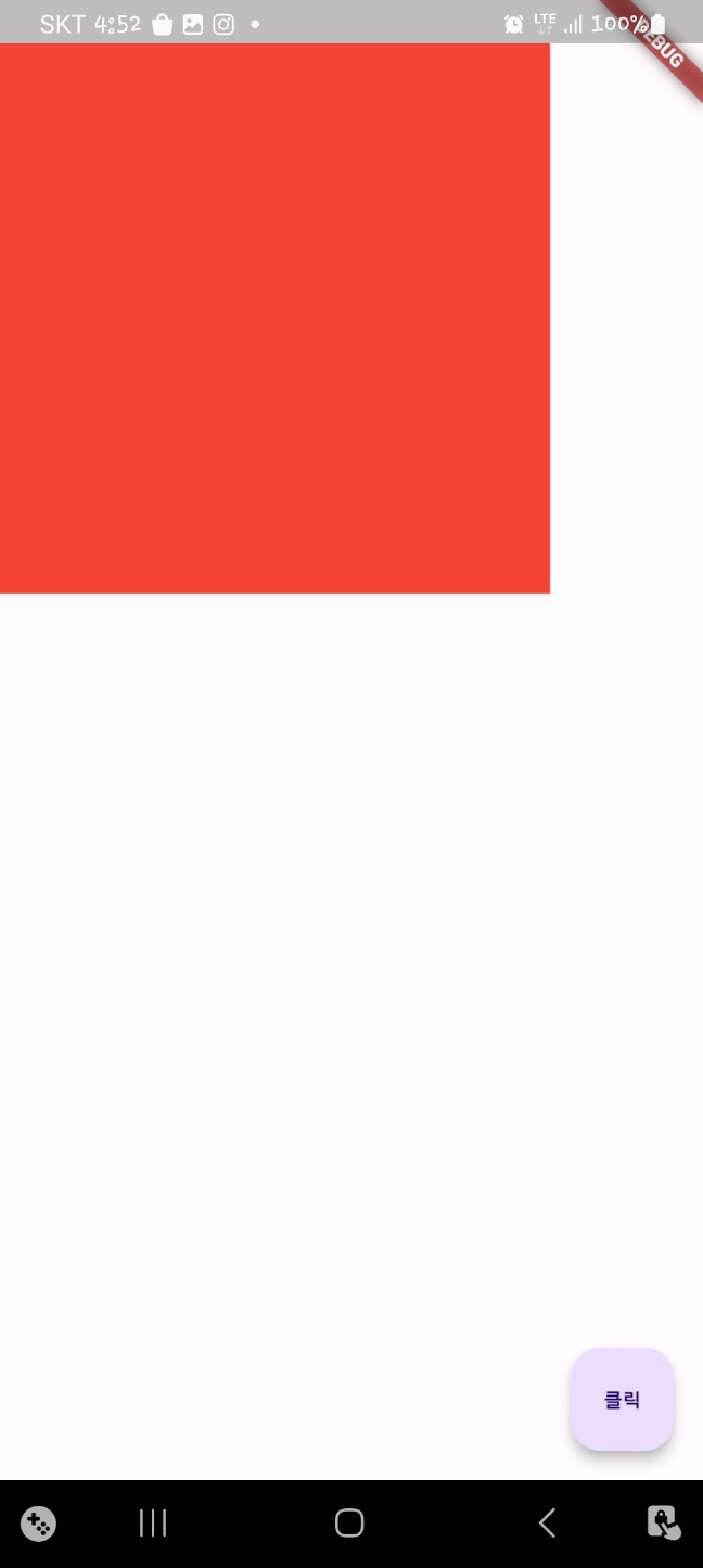
한번 적용하지 않고도 해보겠습니다.
import 'package:flutter/material.dart';

void main() {
  runApp(MyApp());
}

class MyApp extends StatelessWidget {
  @override
  Widget build(BuildContext context) {
    return MaterialApp(
      home: Scaffold(
        floatingActionButton: FloatingActionButton(
          onPressed: () {},
          child: Text('클릭'),
        ),
        body: SafeArea(
          //원하는 부위만 따로 적용가능
          top: false,
          bottom: true,
          left: true,
          right: true,
          child: Container(
            color: Colors.red,
            height: 300.0,
            width: 300.0,
          ),
        ),
      ),
    );
  }
}
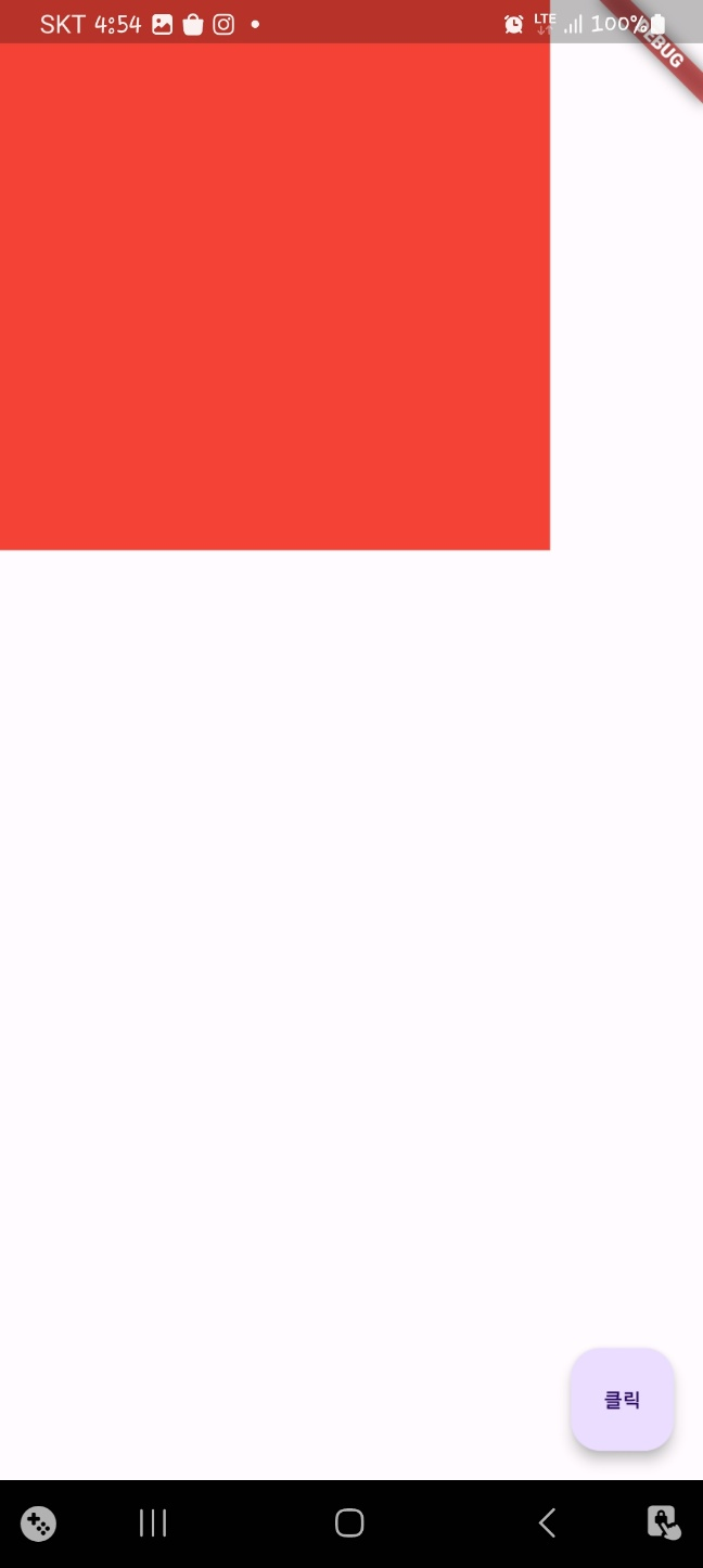
알림바까지 침범한 것을 볼 수 있습니다.
- 배치 관련 위젯
배치 관련 위젯은 하위 위젯을 가로 또는 세로로 배치하거나 위젯 위에 위젯을 겹칠때 사용합니다.
<Row 위젯>
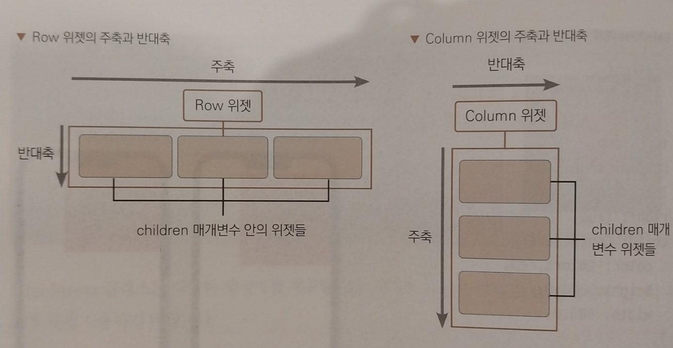
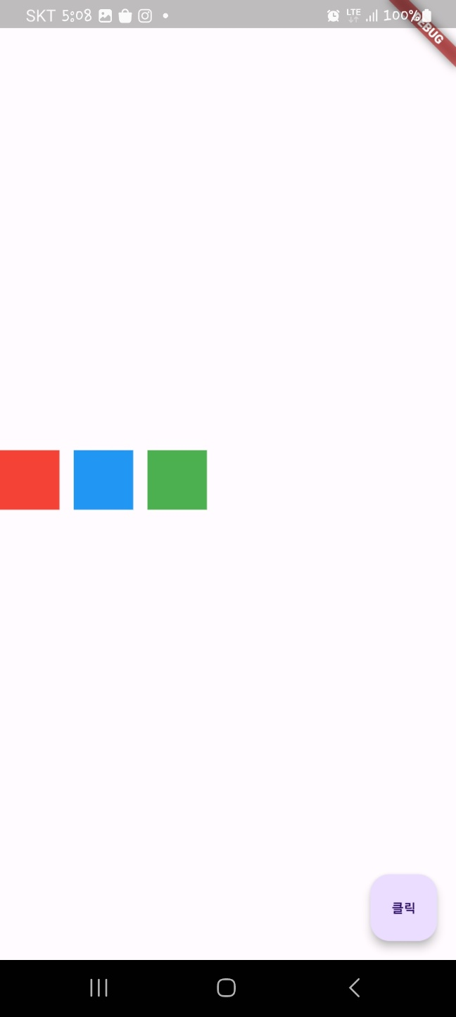
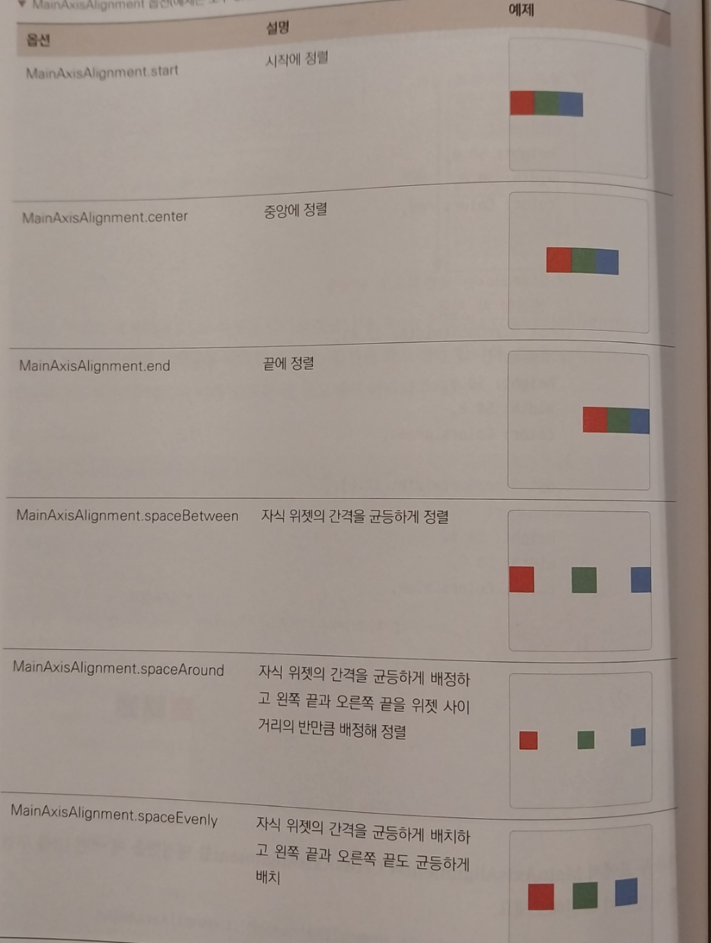
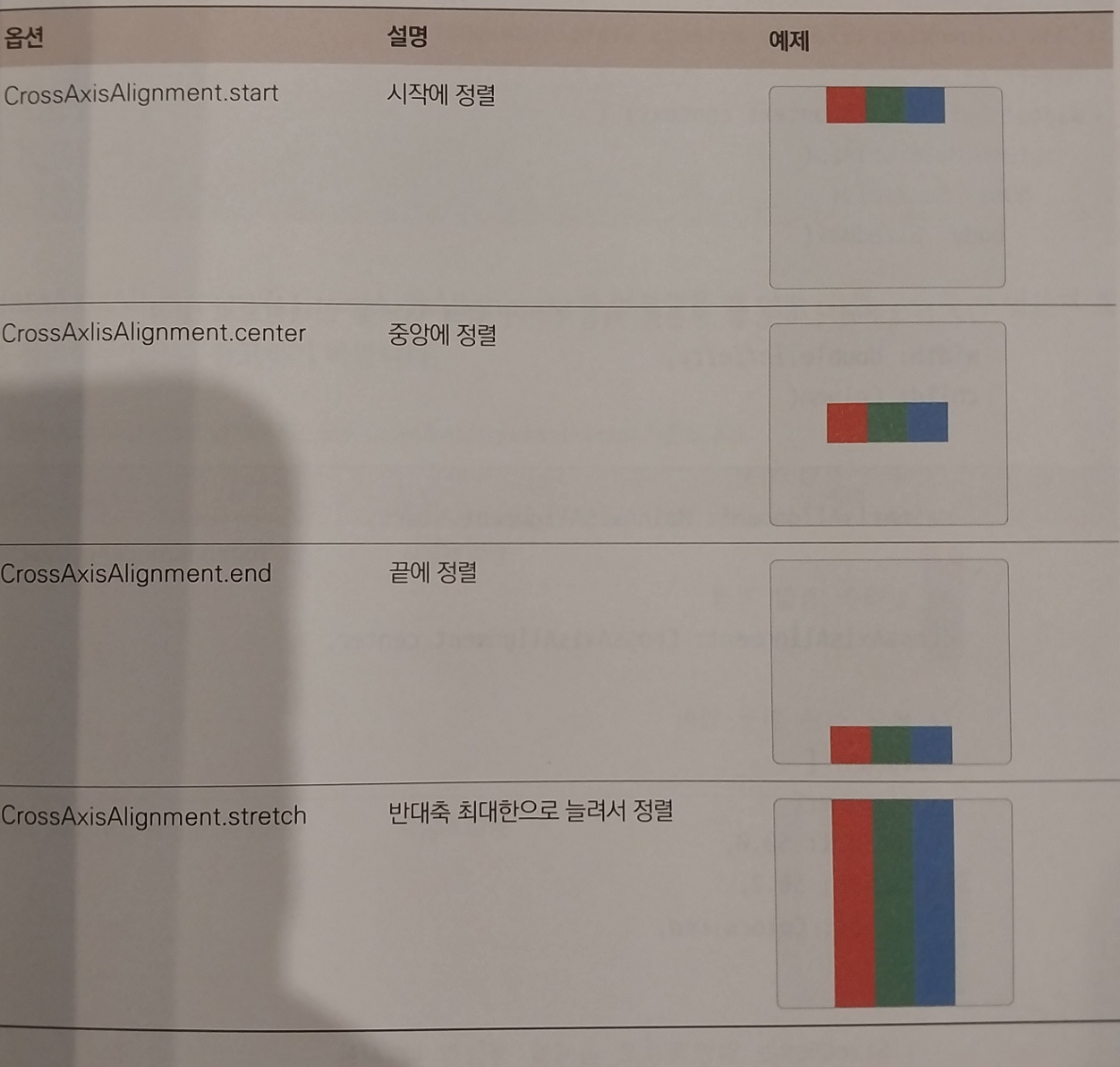
Row는 Column과 함께 위젯을 가로 세로로 배치하는 데 사용합니다. Row는 말 그대로 가로로 위젯을 배치하는데 사용합니다. 하나의 child 위젯을 입력받는 위젯들과 다르게 여러개의 child 위젯을 입력받을 수 있는 children 매개변수를 노출합니다. Row와 Column에는 주축(Main Axis) 와 반대축(Cross Axis)라는 개념이 존재하는데, Row는 가로가 주축, 세로가 반대축이되고 Column은 그 반대가 됩니다.
import 'package:flutter/material.dart';

void main() {
  runApp(MyApp());
}

class MyApp extends StatelessWidget {
  @override
  Widget build(BuildContext context) {
    return MaterialApp(
      home: Scaffold(
        floatingActionButton: FloatingActionButton(
          onPressed: () {},
          child: Text('클릭'),
        ),
        body: SizedBox(

          //반대축에서 이동할 공간을 제공하기위해 높이를 최대한 설정
          height: double.infinity,
          child: Row(

            //주축 정렬 지정
            mainAxisAlignment: MainAxisAlignment.start,

            //반대축 정렬 지정
            crossAxisAlignment: CrossAxisAlignment.center,

            //넣고 싶은 위젯 입력
            children: [
              Container(
                height: 50.0,
                width: 50.0,
                color: Colors.red,
              ),

              //SizedBox는 일반적으로 공백을 생성할떄 사용
              const SizedBox(width: 12.0,),
              Container(
                height: 50.0,
                width: 50.0,
                color: Colors.blue,
              ),
              const SizedBox(width: 12.0,),
              Container(
                height: 50.0,
                width: 50.0,
                color: Colors.green,
              ),
            ],
          ),
        )
      ),
    );
  }
}
주축은 시작지점으로 즉 가로중에 왼쪽에 붙여서 시작하고 반대축은 센터로 세로중에서 가운데에서 시작하게됩니다.
아래는 주축과 반대축 옵션입니다.
<Column>
import 'package:flutter/material.dart';

void main() {
  runApp(MyApp());
}

class MyApp extends StatelessWidget {
  @override
  Widget build(BuildContext context) {
    return MaterialApp(
      home: Scaffold(
          floatingActionButton: FloatingActionButton(
            onPressed: () {},
            child: Text('클릭'),
          ),
          body: SizedBox(

            //반대축에서 이동할 공간을 제공하기위해 너비를 최대한 설정
            width: double.infinity,
            child: Column(

              //주축 정렬 지정
              mainAxisAlignment: MainAxisAlignment.start,

              //반대축 정렬 지정
              crossAxisAlignment: CrossAxisAlignment.center,

              //넣고 싶은 위젯 입력
              children: [
                Container(
                  height: 50.0,
                  width: 50.0,
                  color: Colors.red,
                ),

                //SizedBox는 일반적으로 공백을 생성할떄 사용
                const SizedBox(height: 12.0,),
                Container(
                  height: 50.0,
                  width: 50.0,
                  color: Colors.blue,
                ),
                const SizedBox(height: 12.0,),
                Container(
                  height: 50.0,
                  width: 50.0,
                  color: Colors.green,
                ),
              ],
            ),
          )
      ),
    );
  }
}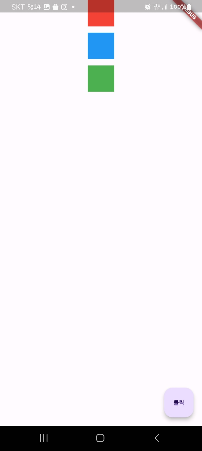
매개변수는 Row와 동일하지만 방향이 반대입니다.
<Flexible>
Flexible 위젯은 Row나 Column에서 사용하는 위젯으로 얼만큼의 비율로 공간을 차지할지 지정할 수 있습니다.
import 'package:flutter/material.dart';

void main() {
  runApp(MyApp());
}

class MyApp extends StatelessWidget {
  @override
  Widget build(BuildContext context) {
    return MaterialApp(
      home: Scaffold(
          floatingActionButton: FloatingActionButton(
            onPressed: () {},
            child: Text('클릭'),
          ),
          body: Center(
            child: Column(
              children: [
                Flexible(
                  //남은 공간을 차지할 비율로 기본값은 1입니다.
                  flex: 1,

                  //파란색 컨테이너
                  child: Container(
                    color: Colors.blue,
                  ),
                ),
                Flexible(

                  flex: 3,

                  child: Container(
                    color: Colors.red,
                  ),
                )
              ],
            ),
          )
      ),
    );
  }
}
이렇게하면 블루가 1 레드가 3으로 1:3의 비율로 출력됩니다. column이니 세로로입니다.
<Stack>
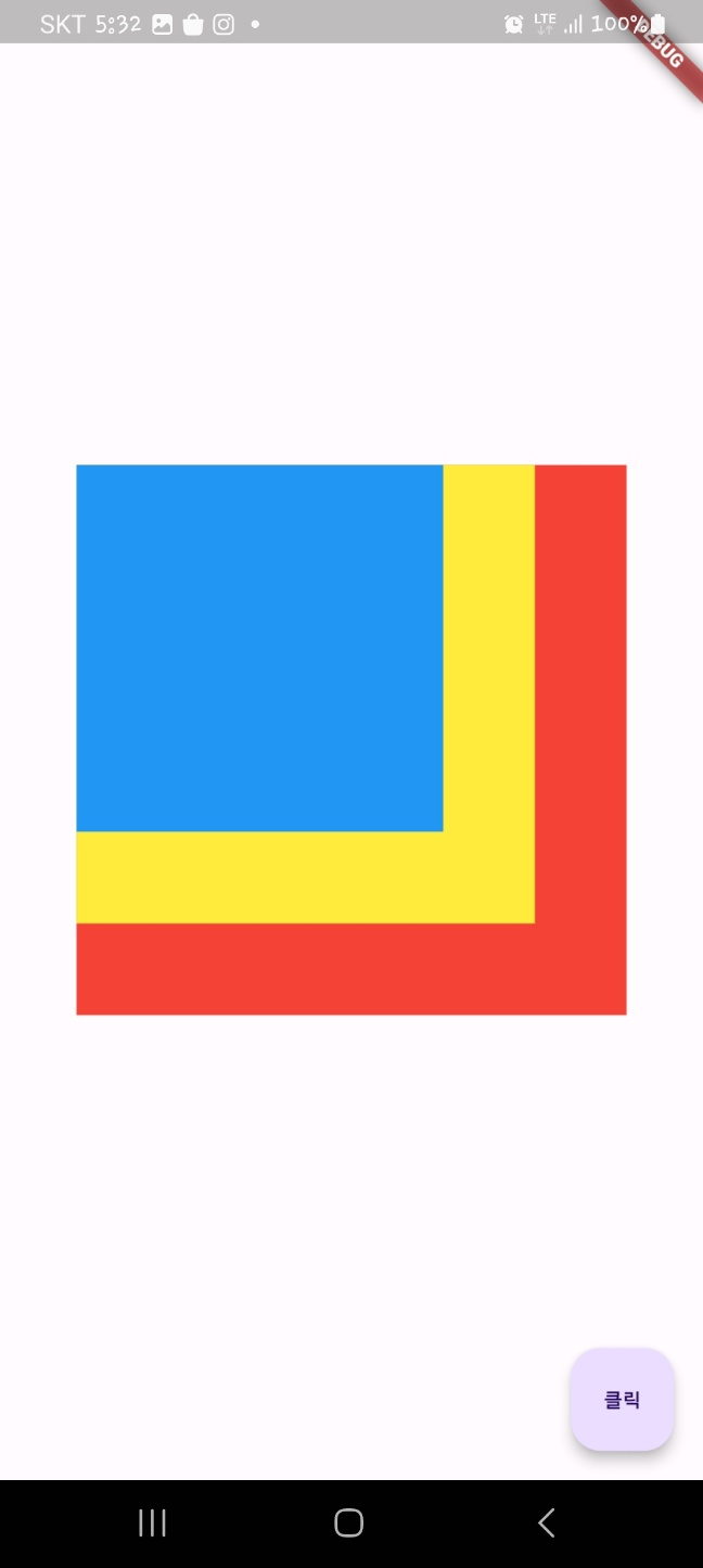
Stack은 위젯을 겹치는 기능을 제공합니다. 플러터의 그래픽 엔진인 스키아 엔진은 2D 엔진이기 때문에 겹친 두께를 표현하지 못하지만 Stack을 사용하면 위젯 위에 위젯을 올린듯한 효과를 줄 수 있습니다.
import 'package:flutter/material.dart';

void main() {
  runApp(MyApp());
}

class MyApp extends StatelessWidget {
  @override
  Widget build(BuildContext context) {
    return MaterialApp(
      home: Scaffold(
          floatingActionButton: FloatingActionButton(
            onPressed: () {},
            child: Text('클릭'),
          ),
          body: Center(
            child: Stack(
              children: [
                Container(
                  height: 300.0,
                  width: 300.0,
                  color: Colors.red,
                ),

                Container(
                  height: 250.0,
                  width: 250.0,
                  color: Colors.yellow,
                ),

                Container(
                  height: 200.0,
                  width: 200.0,
                  color: Colors.blue,
                ),
              ],
            )
          )
      ),
    );
  }
}
한번 봐보겠습니다.
'Programming > Flutter' 카테고리의 다른 글
| Flutter 프로그래밍 - 6(만난지 며칠 앱 만들기) (0) | 2024.01.08 |
|---|---|
| Flutter 프로그래밍 - 5(전자액자 만들기) (0) | 2024.01.07 |
| Flutter 프로그래밍 - 4(블로그 웹 앱 만들기) (0) | 2024.01.06 |
| Flutter 프로그래밍 - 3(스플래시 스크린 만들기) (0) | 2024.01.04 |
| Flutter 프로그래밍 - 1(hello world) (0) | 2024.01.02 |


